Azure
#026CDF
R 2, G 108, B 223
C 100, M 51, Y 0, K 0
PMS 300c
Black Pearl
#1F262D
R 31, G 38, B 45
C 100, M 51, Y 0, K 0
PMS 300c
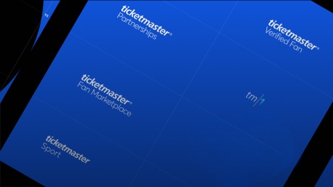
This living brand book provides concepts and assets that make up our brand.
Ticketmaster uses colors purposefully to communicate how things function in the interface. This helps us create visual patterns that can make interacting with our product easier and more predictable for users.
#026CDF
R 2, G 108, B 223
C 100, M 51, Y 0, K 0
PMS 300c
#1F262D
R 31, G 38, B 45
C 100, M 51, Y 0, K 0
PMS 300c

Don't sample colors. The 'eye dropper' or color sampling tool is inaccurate.
Don't allow your software to convert from RGB to CMYK— it will be wrong.
#00C5DD
R 0, G 197, B 221
C 100, M 51, Y 0, K 0
PMS 300c
Don't sample colors. The 'eye dropper' or color sampling tool is inaccurate.
#17252C
R 23, G 37, B 44
C 100, M 51, Y 0, K 0
PMS 300c
#62737C
R 98, G 115, B 124
C 100, M 51, Y 0, K 0
PMS 300c
#C9D2D7
R 201, G 210, B 215
C 100, M 51, Y 0, K 0
PMS 300c
#E5E9EB
R 229, G 233, B 235
C 100, M 51, Y 0, K 0
PMS 300c
#F8F9F9
R 248, G 249, B 249
C 100, M 51, Y 0, K 0
PMS 300c
#262626
R 38, G 38, B 38
C 100, M 51, Y 0, K 0
PMS 300c
#727272
R 114, G 114, B 114
C 100, M 51, Y 0, K 0
PMS 300c
#A8A8A8
R 168, G 168, B 168
C 100, M 51, Y 0, K 0
PMS 300c
#026CDF
R 2, G 108, B 223
C 100, M 51, Y 0, K 0
PMS 300c
#2CFDFE
R 2, G 108, B 223
C 100, M 51, Y 0, K 0
PMS 300c
Grid systems are used for creating page layouts through a series of rows and columns that house your content. Ticketmaster uses a responsive, mobile first, fluid grid system that appropriately scales up to 12 columns as the device or viewport size increases.
| Prop | Screen Size | Margins | Gutters | Columns |
|---|---|---|---|---|
| small | ≤768px | 16px | 16px | 12 |
| medium | ≥768px | 24px | 24px | 12 |
| large | ≥1024px | 24px | 24px | 12 |
| xlarge | ≥1440px | 24px | 24px | 12 |
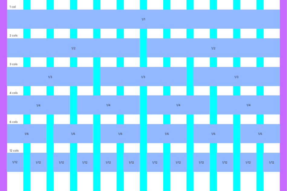
The grid system is based on a 12 columnlayout with a 24px gutter and 24px margins. The grid is fluid and will scale to the width of the viewport.
Lorem ipsum dolor sit amet, consectetur adipiscing elit, sed do eiusmod tempor incididunt ut labore et dolore magna aliqua. Ut enim ad minim veniam, quis nostrud exercitation ullamco laboris nisi ut aliquip ex ea commodo consequat. Duis aute irure dolor in reprehenderit in voluptate velit esse cillum dolore eu fugiat nulla pariatur. Excepteur sint occaecat cupidatat non proident, sunt in culpa qui officia deserunt mollit anim id est laborum.
Motion is a powerful tool for creating a more delightful and understandable experience. It can help people understand the relationships between different parts of the product, and it can also make interactions feel more natural.
When it comes to motion, we follow these principles. They help us create a consistent experience across our products. They also help us create a more delightful experience for our users. Motion is a powerful tool for creating a more delightful and understandable experience.
It can help people understand the relationships between different parts of the product, and it can also make interactions feel more natural. It can help people understand the relationships between different parts of the product.We are designing the future of live entertainment. Explore our open design roles and get in touch.
Junior Designer
TORONTO
Junior Designer
NEW YORK CITY
Designer
LOS ANGELES
Associate creative director
LONDON
Creative director
TORONTO
Junior Designer
TORONTO
Designer
LOS ANGELES
Associate creative director
LONDON
Junior Designer
NEW YORK CITY
Creative director
TORONTO